
 kiruthiga
55473b7e7c
initial push
kiruthiga
55473b7e7c
initial push
|
vor 5 Tagen | |
|---|---|---|
| .. | ||
| bundles | vor 5 Tagen | |
| esm2015 | vor 5 Tagen | |
| esm5 | vor 5 Tagen | |
| node_modules | vor 5 Tagen | |
| scss | vor 5 Tagen | |
| LICENSE | vor 5 Tagen | |
| README.md | vor 5 Tagen | |
| change-context.d.ts | vor 5 Tagen | |
| compatibility-helper.d.ts | vor 5 Tagen | |
| event-listener-helper.d.ts | vor 5 Tagen | |
| event-listener.d.ts | vor 5 Tagen | |
| math-helper.d.ts | vor 5 Tagen | |
| ng5-slider.d.ts | vor 5 Tagen | |
| ng5-slider.metadata.json | vor 5 Tagen | |
| options.d.ts | vor 5 Tagen | |
| package.json | vor 5 Tagen | |
| pointer-type.d.ts | vor 5 Tagen | |
| public_api.d.ts | vor 5 Tagen | |
| slider-element.directive.d.ts | vor 5 Tagen | |
| slider-handle.directive.d.ts | vor 5 Tagen | |
| slider-label.directive.d.ts | vor 5 Tagen | |
| slider.component.d.ts | vor 5 Tagen | |
| slider.module.d.ts | vor 5 Tagen | |
| tooltip-wrapper.component.d.ts | vor 5 Tagen | |
| value-helper.d.ts | vor 5 Tagen | |
README.md
ng5-slider

Website: https://angular-slider.github.io/ng5-slider/
Self-contained, mobile friendly slider component for Angular 5+ based on angularjs-slider.
Demos
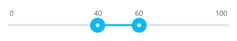
- Single slider - StackBlitz
- Range slider - StackBlitz
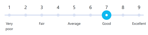
- Slider with ticks - StackBlitz
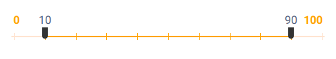
- Customised slider - StackBlitz

- Slider with custom style - StackBlitz
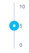
- Vertical slider - StackBlitz
Dependencies
- Angular 5+
- rxjs 5+
Installation
To add the slider to your Angular project:
npm install --save ng5-slider
Once installed, add the slider to your app.module.ts:
import { Ng5SliderModule } from 'ng5-slider';

...

@NgModule({
   ...
   imports: [
     ...
     Ng5SliderModule,
    ...
   ],
   ...
})
export class AppModule {}
Sample usage
Now you can use the slider component in your app components, for example in app.component.ts:
import { Options } from 'ng5-slider';
...
@Component({...})
export class AppComponent {
value: number = 100;
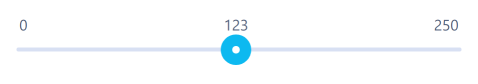
options: Options = {
floor: 0,
ceil: 200
};
}
And in template file app.component.html:
<ng5-slider [(value)]="value" [options]="options"></ng5-slider>
Documentation
Full API documentation is available on official website.
Styling
An overview of how to apply your own style to the slider is described in STYLING.md.
Animations
As of v1.2.0 the slider features CSS animations of slider movement. If you prefer the previous behaviour, without animations, you can set the flag animate: false in your slider options.
Tooltips
The slider allows for customising how to implement tooltips. See TOOLTIPS.md for more information.
Known Issues
Before reporting a new bug, please look at KNOWN_ISSUES.md for a list of known problems and their workarounds. New bugs reports for these problems will not be accepted.
Bugs
You can report any bugs as Github issues.
Please describe the issue in detail pasting any relevant code, or preferrably a StackBlitz with reproduction of the problem by forking and editing this sample StackBlitz. Please also provide the version of NPM package you are using.
Changelog
For list of changes and bugfixes, see CHANGELOG.md.
Developer information
If you would like to contribute to the project, see DEVELOPERS.md.
License
The project is licensed under the MIT license.